Welcome to Curious Materials

Introducing Curious Materials artwork by Lynne. Curious as in eager to know or learn something, uncommon mix, thought provoking. Materials as in ingredients, supplies- think building materials to build a house.
I only sell my pieces at art fairs, festivals, and markets. This way I get the opportunity to meet the folks that are delighted with my work.

Curious Materials, mixed-media artwork is handcut, uncommon mixed medium painting s and papercrafts created to delight your artistic imagination.
Mixed-media paintings and paper crafts.
Curious Materials makes acrylic paintings on canvas with paper collage and found object embellishments. Also collaged papercraft pieces:
note cards with envelope and sticker seal.
2 pre-made scrapbook pages.
mini journals with pockets filled with 10 pieces of themed ephemera.
30 piece journal ephemera kits for those who wish to create journals themselves.

Panting on canvas sample.

Note card sample

Scrapbook page sample.

Mini journal sample.

Journal ephemera kit sample.
Visit to the Butterfly House

Have you ever been to the Magic Wings butterfly house at the Durham Museum of Life and Science? It's a walk through a woodland fantasy. Don't forget to wear red or other bright color so the butterflies visit you.
Curious Materials creates two pre-made scrapbook pages with spaces to add photos or journal your visit.
Finding your artwork style
When I first started selling my artwork I was painting with watercolor on paper. I mostly did paintings of sea life: fish, sea turtles, mermaids. But my favorite was a closeup of a face that I overlayed with flowers and tiny text. Not exactly a popular style at the time.

I moved to acrylic pigment in 2010 because it dries faster and if you dilute it with water you can paint translucent layers of color instead of mixing color on the pallet. I started adding doodling to my paintings. A visitor to my booth suggested I google zentangles. After that as the saying goes, I put them on everything.
l have always wanted to be a licensed artist so in 2014 I created a few collections to send to agents. My favorite was "Behind the binoculars". I usually used a black background for drama, but this was a happy yellow.

I had to quit painting in 2016 and finally recovered enough vision to paint again in 2021. When I started painting for Curious Materials (2021) my favorite piece ended up being "Beautiful Mind". It is bright and colorful; it made me feel happy.

.
Found objects
The most fun thing about making mixed-media artwork is finding objects to incorporate into your pieces. Take for instance the painting, "Blue Collar". I found the blue pin and the little blue butterfly pin at the Liberty Antique festival last fall. The lace from the collar was found in my husband's grandmother's antique sewing machine cabinet. Together they create a unique piece of art.

The Process of Layering
I usually start the design process from whatever I found object l'm wanted to use.
I started this project with red-orange beads my husband make with polymer clay years ago. They reminded me of red berries. To make them look more like berries than beads I knotted the end of a strand of catfish line. I started using catfish line for tags a while ago because its waxed coating does not unravel easily and tangle up like string, twine, or yarn.
I cut a bunch of yellow paper flowers and leaves from botanical book pages I purchased at a library book sale a long time ago (before the internet you needed reference photos and illustration books). That's where the bird illustrations came from too.
The first step was to paint a portrait on canvas with acrylic paint.

After letting it dry, I painted a background layer around the portrait.


After that I glued down the collage paper layer.
Then continue on with the final layer to sit on top of the paper layer.
The photos illustrate it better than my description but there is some method to my madness.

Something in the water

I love mermaids. When I scuba dive I enjoy swimming through schools of yellowtails and feeling like a mermaid.
Pair a magnet with a cluster of tiny shells, seashells combed on Sanibel beach, watercolor pencil drawn and cut paper shells, with cut blue and white paper hair strands to embellish a transparent acrylic painting. I call it Something in the water.
Why art journal?
Even after I had my eye surgery my vision was not the same. So in January of 2021 I started an art journal to experiment with different collage techniques. I journaled every day for 30 days.
My second journal was a true journal; journaling every day for 30 days and creating around thoughts that day.
The third exercise was a sketchbook. I tried to do only human faces, every angle, every view. But I didn't draw every day (the weather was getting nice) and I snuck in a cat, bunny, and flowers.
So why art journal? It gets you to carve out time to create every day and helps you narrow down what technique you want to develop.

In the back of the journal I attached a envelope with pages of descriptions of all the techniques used in the journal.

Collage in neutral colors and doodles then paint over the collage.

Paint the portrait first then collage cut paper flowers on the paper and fill in with painted flowers.

The first page of the daily journal "Fear of the Blank page".

Later entry "Just have to practice, practice, practice.


Sketchbook practicing with pencil sketching.

Sketchbook practice with watercolor pencil
Inspiration from found object
One day my husband was cleaning out his art supply stash and found all of these faux rhinestone gems in different sizes and shapes. I sorted out the smallest, oblong pieces and started brainstorming what to do with them. They reminded me of the headpieces worn by flappers in the 1920's. I found a picture of bride wearing a Juliet cap. I drew out the girl wearing the cap and placed the larger gems in the center and the smaller ones to sides so it looked like it was contoured on her head; then painted in the rest.
The flower I made from the thin white original page of a blank receipt form. Powder pink blush was used to color the center of the paper flower. I added in the silver dragonfly charm for added interest and texture.
I call it Pretty Things.

Signs of spring
The weather has been so nice the last few days it's been enjoyable just sitting outdoors on the back deck. Although the tree branches are bare; no leaves or birds on them. And the hummingbird feeders are dry and lonely. I still catch myself keeping an eye out for signs of them.
Curious Materials creates notecards with decorated envelope and envelope seal. This one has a little hummingbird sticker you just peel off the backing and seal your greeting inside.

What to do when you don't like the end results?

I did not like this painting. I had two choices either paint over the whole thing and do something else or try to fix what I did not like about it
I looked at it and decided the face was too round. The jawline needed to be thinned so she would have a chin and thin her nose so her eyes would appear larger. And she needed long hair to make her look younger and more attractive. And the flowers needed to be extended up the headpiece.

What do you think?
What is your favorite art documentary?
Mine is The Electrical Life of Louis Wain, 2021 with Benedict Cumberbatch.
In the Victorian era, the practice of keeping a cat as a pet was unusual. But Louis and his sister take in a stray kitten and name it Peter. Louis starts painting Peter in a realistic style. But the paintings soon become more unusual, more anthropomorphic, the cats doing human things.
By 1811, Louis' cat pictures become quite popular. They are printed on postcards, greeting cards, and other printed materials. After Louis sends some of his artwork to the States, the drawings change peoples' perception of cats; making them acceptable as house pets.

Cordon Blu 18x24 painting

Milk and Honey 8x10 painting

art journal pages 7x9
Visit to the Art Museum
One of my favorite artist is Alphonse Mucha. The flowing lines in the ladies' hair threaded thru floral motifs illustrates the Art Noiveau style. The North Carolina Museum of Art hosted an exhibition last October to January 27th. It has been 20 years since they last displayed the work of Mucha at the NCMA.


Nouveau Blooms is inspired by Mucha's paintings. The brass plate is upcycled from an old sewing machine. The braiding completes the look of the headpiece.

Blue
It's cloudy and raining, what people call a blue day. Singing the blues or feeling blue.
But the blue can be a happy color too. Blue skies, beautiful blue, the bluebird of happiness.
I created "Shatter of Blue" as a joyful pallet.
"A butterfly blue
In the wind's soft sway,
Shimmers in pearly hue,
Then flutters away.". Hermann Hesse

Painting Artwork: light to dark vs. dark to light
The difference between watercolor, acrylic, and oil painting isn't just the tube of paint.I
It is the method that is used to capture how the light hits an object. There is different methods of applying color:
- the light to dark method
- the mid tone to shadow and highlight method
- the dark to light method
When I was in college our color theory class was required to paint a paint leaf with every tone, tint, and shade of one hue.
- hue = pure color, 12 hues in the color wheel
- shade =adding black
- tint = adding white
- tone = adding gray
It was an exercise in color mixing and learning to look at the graduating of value - light to dark or dark to light.
It may sound complicating but if you just look at shade, tint, and tone - black, white, and gray, it is easier to understand.

When I draw with graphite I start with the hardest lead so the shading is light. Then I add another layer of shading with the next softest lead; therefore I am creating an image from light to dark.

When I use the gray tones of Prismacolor markers the process is the same as long as I utilize just the cool greys or the French gray, but not mix the two.

But once I go to rendering an image with the color Prismacolor markers, the process changes to shading from mid tones (local color) to shadows and highlights. To create depth, I will add darker colors. The thin layers create a new color when the color underneath shows through. The highlights are created with the lighter colors. I use an opaque white to represent where the light reflects back.

The mid tone method also can be used with acrylic paint. I add white to the paint to create the highlights and black to the paint to create the darker shades. Shadows are created by adding the opposite hue on the color wheel. (blue and orange, red and green, yellow and violet).

When watercolor paint is used, the method of light to dark is employed. Each layer must dry before the next is added. Especially when the darker colors are added; otherwise the paint color becomes muddy. The muddy color is reserved for the shadows. The black and white is used sparsely, usually the black for eye pupils with the white to give the highest contrast against the black pupils.
If black is used in the background an underpainting of blue or violet gives a richer shade of black.

The practice of adding water to thin out acrylic paint creates transparent layers just like watercolor, but it dries faster (too much water creates bubbles in the paint not a smooth transparent layer). So I use the method of light to dark.

Acrylic paint can also be used with the dark to light method. The dark layers should be thinner so the lighter color can sit on top of the darker colors if the layers are applied thicker so the dark color is covered.
The dark to light method is usually used for oil painting. I have never used oil paint. It requires oil base additives to thin the paint and different paint brushes in addition to pallet knives. Not to mention it takes a long time to dry (1 to 72 hours).
Since I paint with water thinned acrylic paint I use watercolor wash brushes and acrylic round and liner brushes. But thinning out the paint with water uses less paint.
So if you experiment with the three methods not only are you building your skills but you will discover what method works best for you. Then you can choose your paint.
Collaging with Simple Shapes
Collages need not be complicated shapes and patterns with ripped and torn papers. A successful piece of artwork can be achieved with simple shapes.
Circles - the center of the flower is created with small circles. The multicolor circles blend the colors by overlapping the dots of color.
Squares - the small squares transition the eye and the flower into the pedals.
Rectangles - the rectangles stretch the squares into elongated petals. The mixture of colors give depth and texture to the flower.
The "Hello" painting illustrates the concept that collaging with simple shapes is effective without complicating shapes and patterns.

Are you a rebel?
What do you consider a rebel, breaking the rules, living outside the law, thinking outside the box?
There are rules of grammar, laws of science, and principles of art.
Principles of art
- Balance
- Proportion
- Emphasis
- Variety
- Movement
- Rhythm
- Harmony
You have heard of breaking the rules, breaking the law, but how do you break a principle?
Before you attempt to rebel against the rules artists must first understand them.
Think of the elements of design as a list ingredients and the principles of art as the directions of how to put them together. You would not use all the ingredients in the pantry but you can expiriement a few you usually wouldn't use together. To bend or break the rules is to change the directions of how you put them together. An artist who is considered innovative is usually breaking a principle like proportion, harmony, or balance in a big way so the viewer understands he feels uncomfortable because the artist is doing it on purpose and it isn't just a small mistake the artist did not fix.
"Learn the rules like a pro so you can break them like an artist".
Pablo Picasso
I'm no rebel.

What is a Junk Journal?
Junk journals are not all the same, but consensus is they are mostly a mix of found and recycled materials made into a homemade book.
For some people a junk journal is like a junk drawer, it has a bit of everything and anything. I think of it as when you clean out your handbag, and you have a pile of stuff you wish to keep but not tote around with you everyday.
People use them to collect and record memories, thoughts, ideas and inspirations. This is achieved by packing the journal with the tuck spots and pockets filled with pieces to write on. The pockets provide a flexible way to add, subtract, or move the "junk" around.

The art of collecting found objects
When I started sailing I started collecting pirate and mermaid related objects. Then I learned to scuba dive and I collected more. Artwork, jewelry, books, tee shirts, etc. Everything from flint lock repilcas, a pole size skull and cross bones flag, to mermaid sculpture and perfume bottles.
I sold most of my pirate collection at the Pirate Chest, a consignment shop, when the first Pirate of the Caribbean movie came out. The mermaid collection has been thinned out too. Now when I go to an antique shop, fair, flea market, or estate sale, I look for objects to create mixed media art. A brooch, charm, magnet, earring, pin and epherma are constantly luring me to hunt for treasure. I guess I just traded one addiction for another.

Where do your ideas come from?
Look through any tin of cookie cutters and you will usually find the classic heart shape with the fluted edges. It's the idea that the common object can be transformed into a visual image others can see is the artist's purpose.
With a metal cookie cutter, rusty sewing bobbin, watch parts with gears, and tiny gear shaped embellishments I created a clockwork heart.

At the end of the silver chain stands a girl in pigtails dressed in a blue gingham dress. "You gave me your heart" is a collage of materials and imaginary tales.
Dru Pagliassotti authored Clockwork Heart in 2009. It was the first Steampunk romance novels. Yet Frank L. Baum wrote The Wonderful Wizard of Oz in 1900. He in fact created the first clockwork heart and gave to the tin man.
All the books you read, movies you see, or content you stream get banked into your mind's library. It is the artist's purpose to bring it to life.

Snippets of Vintage
Vintage is defined as something being old fashion and timeless classic.
In the Antique and Collectable world:
An antique is100 years and older
- Collectable is less than100 years old
- Vintage is less than25 years old,;it has cycled back into fashion.
- Retro is considered outdated and out of style
- Nostalgia is two decades that are 20-30 before the current one
In the Design world:
- Victorian era 1837 - 1901
- Arts and Crafts style 1880 - 1920
- Art Nouveau 1900 - 1910
- Art Deco. 1920 - early 1940's
- Farmhouse style 1930 - 1940
- Mid Century Modern 1950 - 1960
- Hippy\ Bohemian \counter cultural 1970
- Punk. 1970 - 1980
- Post Modern. 1980 - 1990
- Shabby Chic 2000
- Cottage core. 2010
I created Snippets of Vintage, an unfilled junk journal to populate with whatever Vintage you like to collect.


The Land of Art
Living in the middle of 5 acres of trees, just going out the door places you in nature; no cement walkways, driveway, sidewalk, or street. The ever incroaching forest surrounding the house must be cut back so when storms uproot trees and rip their branches out and send them flying they do not fall on your house. In addition to the septic field, gravel driveway, a place to park cars, is a force field of gardens (veggie, floral, butterfly, and sculpture) to keep the forest seedlings at bay; plus less grass to cut.
Therefore it is not hard to understand how my artwork is influenced by nature. Dorthy has the Land of Oz, Alice has Wonderland, Peter has Neverland. I have Natureland.

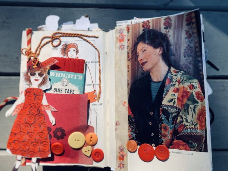
Bringing in the Color
I hemmed and hawed in the antique store thinking about purchasing a plaid fabric rose pin. It is lovely, but not very colorful. Being colorful is one of the criteria I assigned to the hunt for embellishments. Yet it is beige, brown, and black. I leave it go.
The next time I visit the shop the plaid rose is still there. I guess it was meant to be. I buy it and a shortly after I find decorative plaid paper with gold and orange threaded thru the beige and brown design.
While it sat on my to do pile, I started binge watching a UK competition show called Portrait Artist of the year. One of the backdrops for the portrait sitter was a orange and pink. The artist paints the background in the pink and orange, and also to the model's face. The color not only brightens the portrait but also the skin of the model.
I realize this idea would be a good solution to the plaid rose's blandness.

The decorative paper is used to create the model's coat and the paper flowers. I guess it was meant to be.
"The most valiant thing you can do as an artist is inspire someone else to be creative." Joseph Gordon Levitt
Create Your Own Website With Webador